01 / The Casebook / Portfolio · Product Design
One Practice, Two Records
Designing a portfolio that shows the design decision and the build behind it.
A product design casebook for a personal portfolio built around two records: a Casebook for product design and a Build Log for frontend engineering, connected by an Overview and a shared visual system.
- Role
- Product Design · Frontend Development
- Category
- Portfolio · Product Design
- Status
- Live
- Year
- 2026
01 / Context
A portfolio that has to prove two disciplines without splitting in two.
I work across product design and frontend development. Most portfolios force a choice: show the interfaces and let the build be inferred, or show the code and let the design be inferred. Neither shows the handoff, which is where most product intent is lost.
This portfolio is built on a different premise: one practice, two records. The Casebook carries product design cases. The Build Log carries frontend builds. The Overview connects them.
The structure is the argument. It does not ask a visitor to believe that design and development belong together; it gives each discipline its own evidence and lets the connection speak.
02 / The problem
Different readers arrive with different questions.
A design lead wants to see how I frame a problem, structure information and make interface decisions. A frontend lead wants architecture, data modelling, state and release discipline. A founder wants to know whether one person can carry a product from problem to production.
A single grid of thumbnails serves none of them well. A single long-form template flattens the difference between a shipped product and a concept.
The portfolio needed a structure that lets a visitor choose a lens in seconds, while keeping one coherent brand.
03 / The structure
Three destinations, one practice.
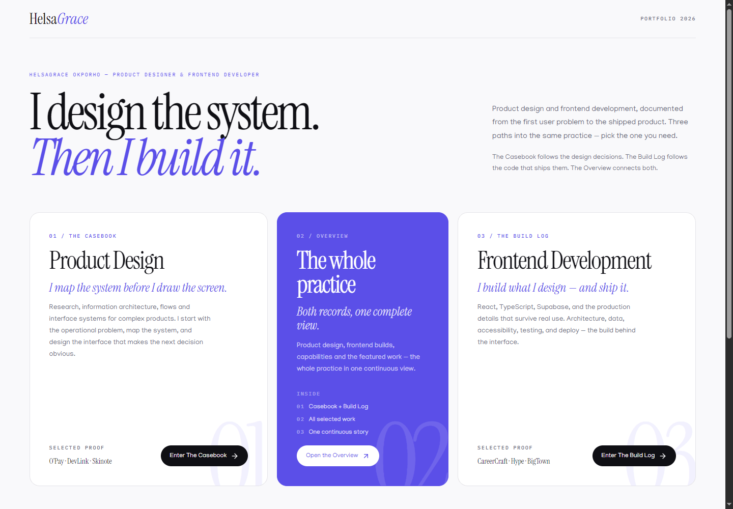
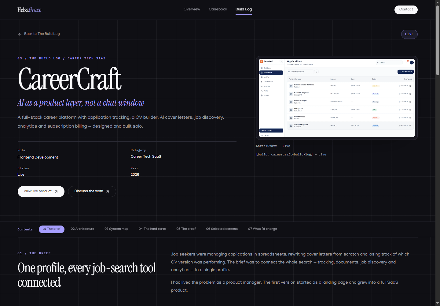
The welcome screen names the practice and offers three explicit ways in. The visual split begins after the choice.
- 01
The Casebook
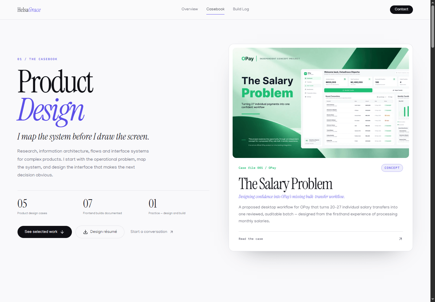
Product design case studies: research framing, flows, interface systems and reflections, on an off-white editorial surface.
- 02
The Overview
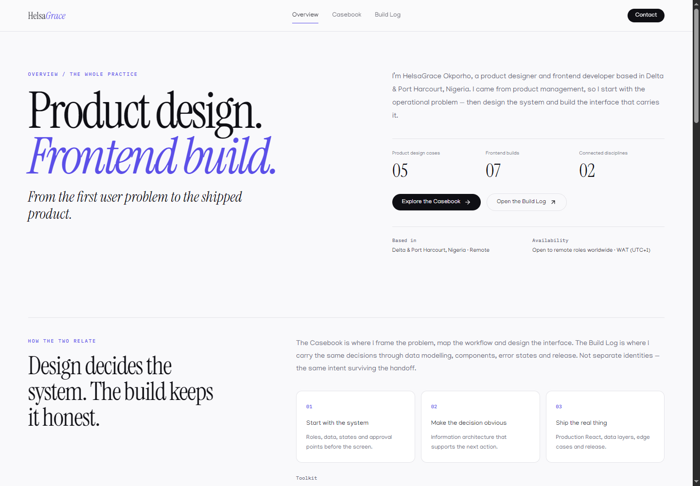
Both records in one continuous view, for readers who want the whole practice before choosing a lens.
- 03
The Build Log
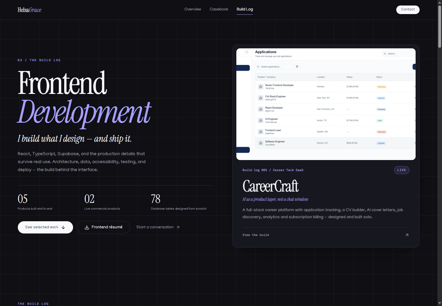
Frontend builds: architecture, data, production proof and the hard parts, on a dark graphite surface.
“One brand, two temperatures. The difference is a change of lens, not a change of identity.”
04 / No duplicate projects
Each project belongs to one record.
The same project does not appear in both records. Duplication would suggest that the records are two views of identical content, when they are actually different kinds of evidence.
The constraint forces a deliberate choice for every project and keeps the library honest. It also keeps the records from competing with each other for the same cover image.
The older lens toggle was removed for the same reason. A toggle implies the same content can be viewed two ways; the records contain different projects and different arguments.
05 / The public surface
Editorial on one side, technical on the other.
06 / The block system
Depth by block, not by page length.
Studies are composed from a fixed block set: narrative, steps, quote, gallery, architecture, reflection, next and system. Each block carries a specific kind of evidence.
The model lets a study choose a few arguments rather than listing everything. It also keeps the reading experience consistent as the library grows.
Images carry alt text and captions. Landscape and portrait sets use different ratios. Galleries can switch between grid and marquee depending on the set.
- Narrative for context and the problem
- Steps for a process or a model
- Architecture for system relationships
- Gallery for real screens
- System for colour, type and components
- Reflection and next for judgement and direction
07 / Information architecture
A shallow public tree with deep records.
Welcome
The practice and three destinations
Casebook
Hub · archive · studies
Overview
Combined practice
Build Log
Hub · archive · studies
Study
Cover · contents · blocks
A visitor reaches either record in one click from the welcome screen or the shared header.
08 / Visual system
Editorial typography, one accent, two surfaces.
The site is closer to a designed publication than a template portfolio. The typography is part of the argument.
Base
#F9F9FB
Light record background
Ink
#0F0F14
Primary text
Accent
#5B4FE8
Brand purple
Accent soft
#EEECFF
Soft accent surface
Graphite
#0F0F14
Build Log background
Typography
Instrument Serif
Manjari
IBM Plex Mono carries labels, metadata and section indices.
Components
- Record hubA large statement, counts and featured cards.
- Study cardCover, kicker, title, subtitle, metadata and a read link.
- Contents railNumbered section labels for long studies.
- Image blockExplicit ratio, fit, caption and optional gallery overlay.
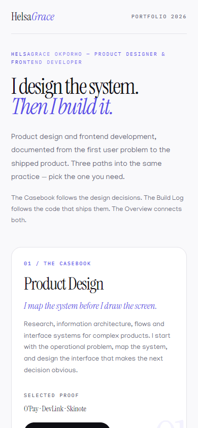
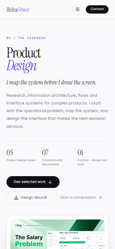
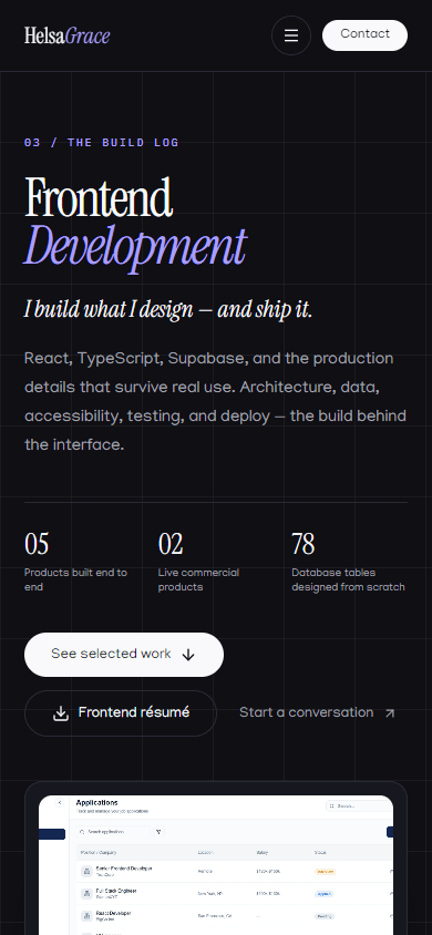
09 / Mobile
The structure holds at 390px.
10 / Reflection
The structure costs more than a grid, and it is worth it.
The central decision was to stop treating design and development as two portfolios joined by a link. The two-record structure costs more navigation and more content discipline, but it makes the practice legible in a way a mixed grid cannot.
The decision I am least settled on is the depth of the Build Log. Engineering evidence is valuable, but a build log can become a second résumé. The block model helps by forcing each study to choose a few arguments.
The part I am most confident about is the shared brand. The records feel different without feeling like different people made them. That is the point.
Two records
Design and build are separate evidence, not duplicate lenses.
One brand
Shared type, colour and components; two surface temperatures.
Block depth
Each study chooses the evidence it needs.
Honest status
Live, In build, Prototype and Concept mean what they say.
11 / What is next
Make the evidence as strong as the structure.
The next improvement is not visual. It is evidentiary. Every Live claim should be traceable to a deployed product and a visible change.
The library also needs the less glamorous work: archive filtering, a sticky contents rail, registry tests and an accessibility audit.
The documentation added on 16 November 2026 is the first step: two projects are now documented as casebook and build log pairs, generated from Markdown so the site and the documents stay aligned.
- Add the remaining project case studies
- Exercise the admin end to end with an owner session
- Run an accessibility and performance audit
- Capture the archive pages in the evidence set
- Keep the status vocabulary current as products ship
Next in The Casebook
The Salary Problem
A proposed desktop workflow for OPay that turns 20–27 individual salary transfers into one reviewed, auditable batch — designed from the firsthand experience of processing monthly salaries.