01 / The Casebook / Education · Admissions
The Reviewed Academy
Designing an enrolment process that earns trust before it takes money.
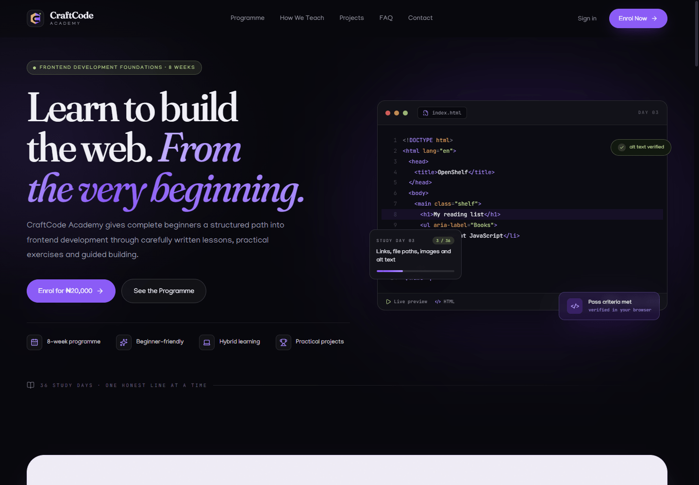
A product design casebook for an eight-week beginner frontend academy in Nigeria: a reviewed enrolment pipeline, a 36-day teaching structure, and a learner and administrator platform designed to be operated honestly by a small team.
- Role
- Product Design · Founder
- Category
- Education · Admissions
- Status
- In build
- Year
- 2026
01 / Context
An academy has to be believed before it can be bought.
CraftCode Academy is an eight-week, 36-day beginner frontend programme in Nigeria. The fee is ₦20,000, paid by ordinary bank transfer. There is no payment gateway, no card collection and no instant access.
That operating model is the design problem. A prospective learner has to decide whether to send real money to an academy with no track record. The interface cannot borrow credibility from scale, so it has to earn it through specificity: the exact curriculum, the exact fee, the exact process and the exact limits.
- Eight weeks and 36 structured study days
- One capstone: OpenShelf, a reading-list application
- Manual Nigerian bank transfer, verified by the academy
- Private receipt evidence and reviewed enrolment
02 / The problem
The beginner does not need more content. They need a sequence they can trust.
The market offers free videos with no order, foreign-currency bootcamps and social-media courses that promise employment. A beginner cannot easily tell which option will leave them with a finished project.
The academy's problem is the mirror image. It has to convert interest into a verified cohort without pretending to be a payment processor, and it has to teach with enough structure that the promise survives contact with a real learner.
I designed for both sides at once. The public site explains the sequence; the enrolment flow separates interest from commitment; the learner area carries the same structure into daily work.
03 / The admission model
Register first. Pay second. Verify before access.
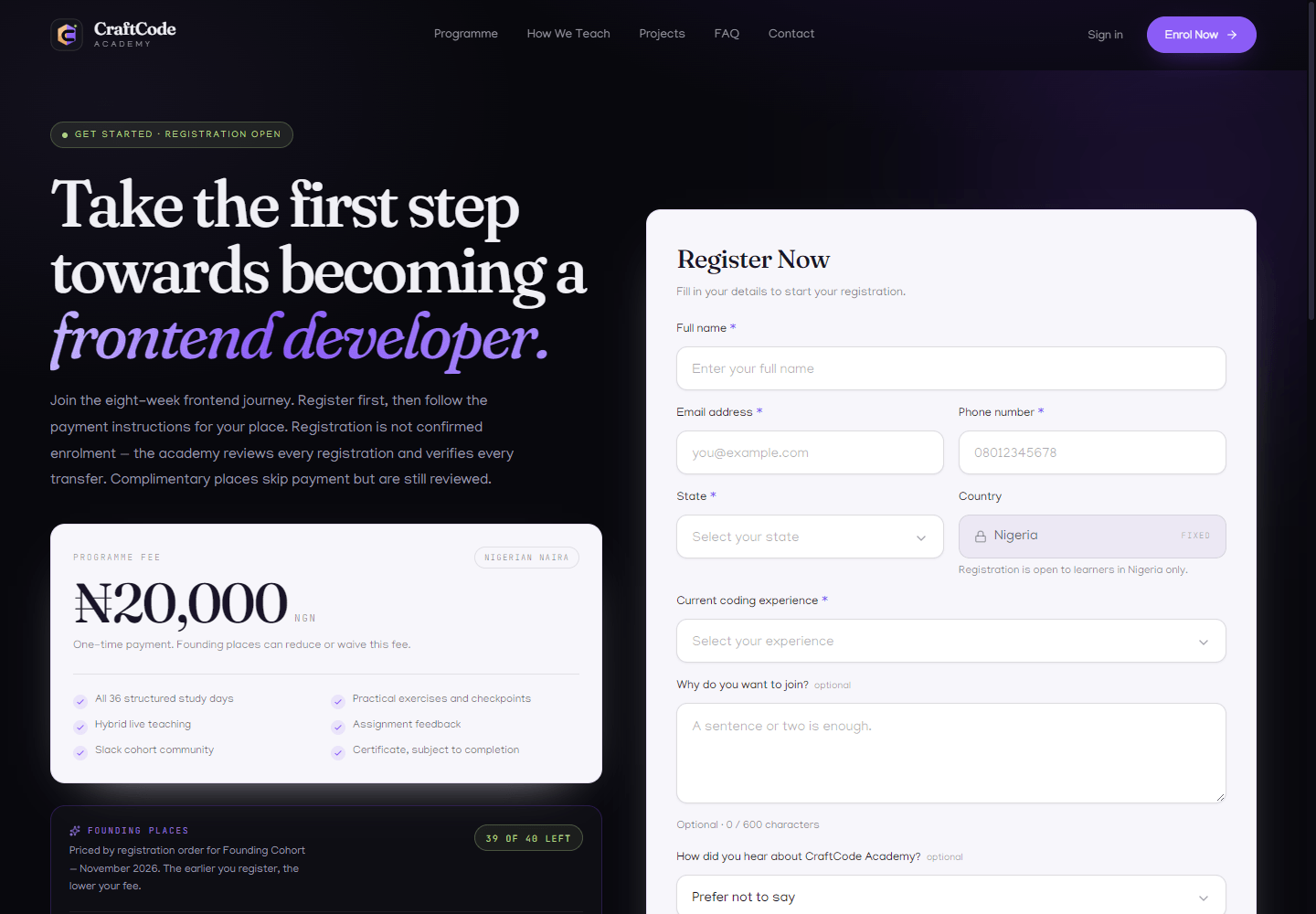
The four steps are stated on the enrolment page and enforced in the database. Registration is explicitly not confirmed enrolment.
- 01
Register your details
The applicant receives a unique reference and a locked price, including any founding-place reduction.
- 02
Pay the amount due
The applicant transfers money through their own bank. Complimentary places skip this step.
- 03
Submit your receipt
Transfer details and evidence are uploaded to a private bucket. No public URL is created.
- 04
Get verified
An administrator checks the bank record, then enrols the learner. Nothing is auto-confirmed.
“A process with a wait is easier to trust when the wait is visible.”
04 / The programme argument
Sell the sequence, not the dream.
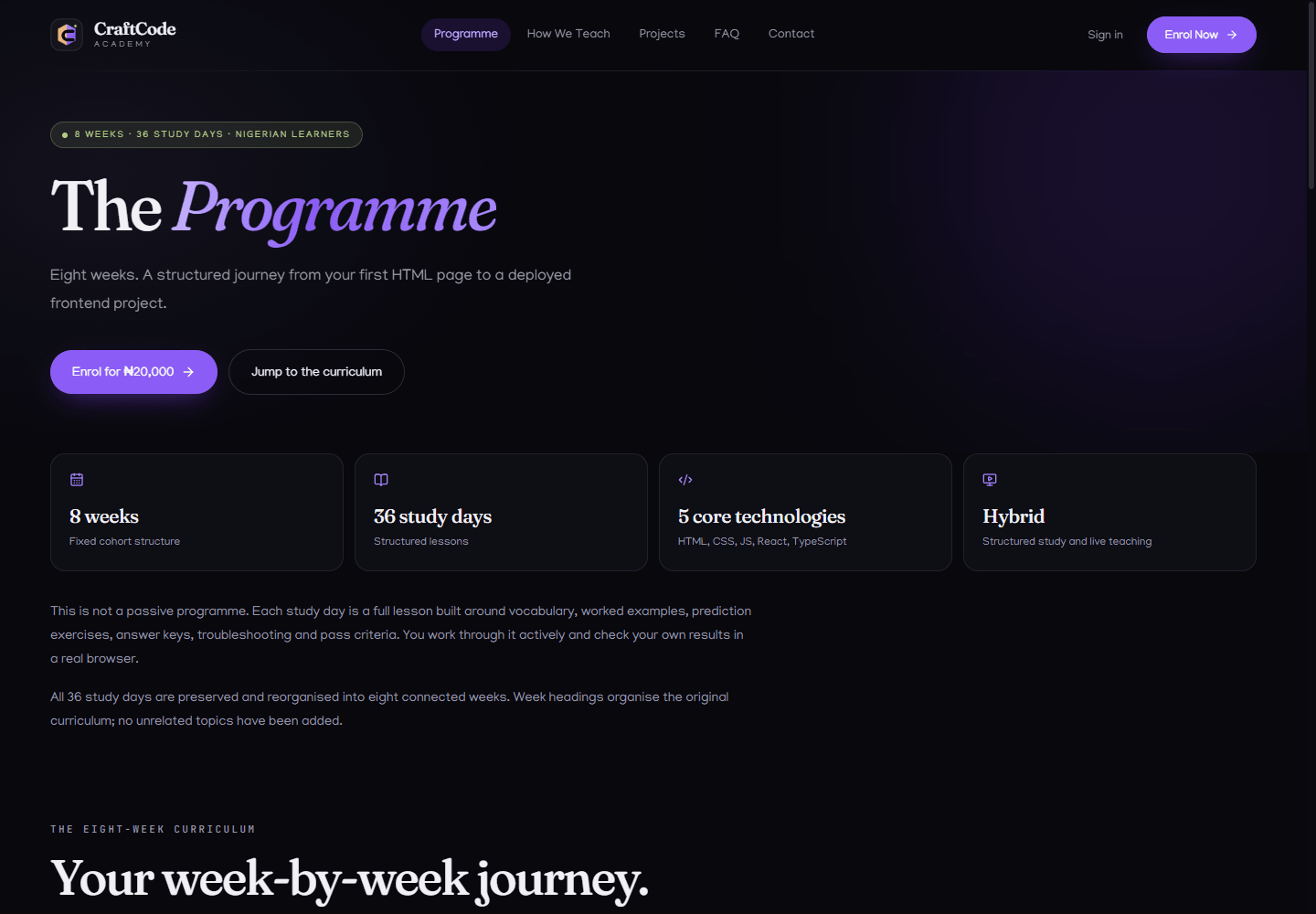
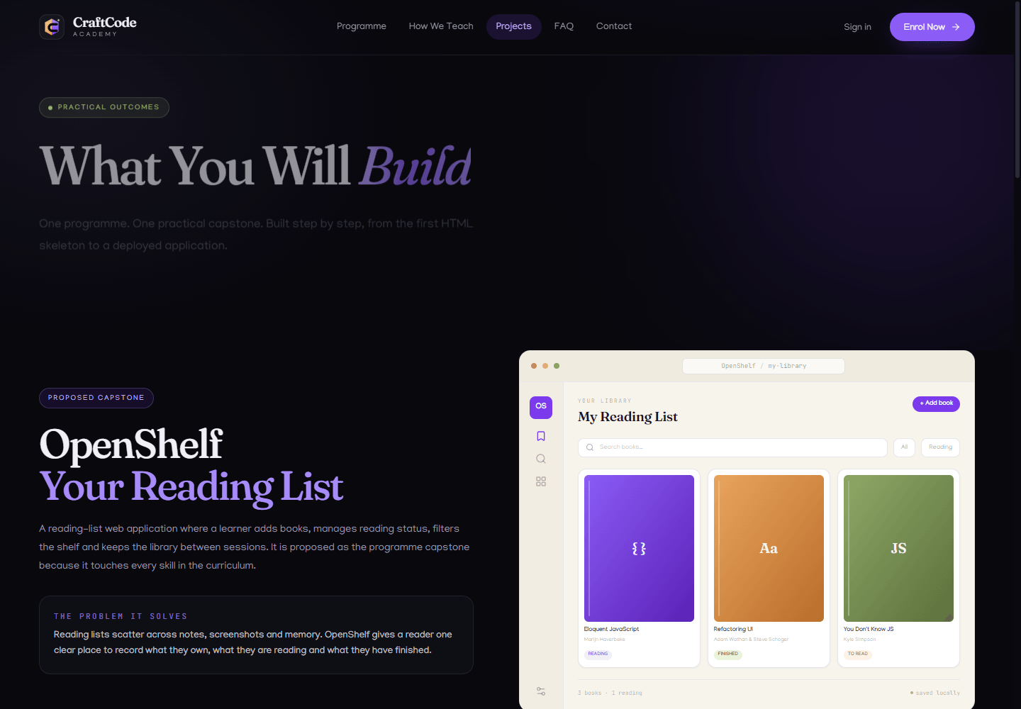
The public site leads with the order of instruction: the web and HTML, then CSS, then JavaScript, then the DOM, then asynchronous work, then React, then TypeScript, then a capstone. It does not lead with income claims.
The price panel states what is included and, in the same panel, states that completing the programme is not a job guarantee. The honest-limits section is the least exciting copy on the site and the one most likely to prevent a mismatch.
I kept the fee concrete and the process explicit. Cards are not collected on the site, and registration is not described as a purchase.
- A dedicated programme page with all eight weeks and 36 days
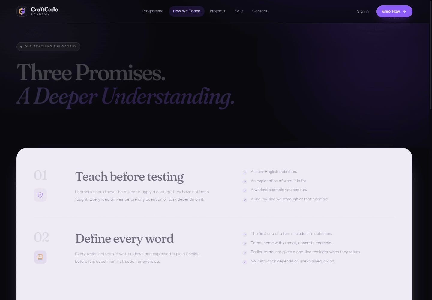
- A methodology page describing the nine-part study day
- A projects page explaining the OpenShelf capstone
- An FAQ that answers objections before the form
05 / The public surface
Explain, then ask.
06 / The teaching model
The credibility depends on the teaching layer, not the landing page.
The learner area carries weeks, lessons, sections, assignments, submissions, results and remediation. Lesson sections can be private, so answer keys never reach the learner view.
Assessment separates a suggested score from a human decision, and separates review from publication. A score can be corrected before the learner sees it.
Remediation is modelled as its own case with items and attempts, not a free-text note. That structure makes follow-up measurable for a small team.
07 / Admissions architecture
One decision, four records.
Applicant
Reference · locked price
Registration
Details · founding place · status
Payment evidence
Private bucket · signed link
Review
Administrator verification
Enrolment
Learner access · audit event
The review step is the gate. No payment is auto-confirmed and no receipt is publicly addressable.
08 / Visual system
Editorial, technical, and slightly austere.
A serif display face and a mono label system give the academy an academic tone without making it look like a school website.
Ink
#0A0A0F
Primary dark surface
Violet
#7C3AED
Single functional accent
Ivory
#EFECF6
Dense information bands
Navy
#1A1529
Text on light
Sage
#B9D78A
Open and positive status
Typography
Fraunces
Manjari
JetBrains Mono carries labels, steps and metadata.
Components
- Section headingEyebrow, display title and a short description.
- Ivory bandA light information surface inside the dark argument.
- Status badgeSmall caps, dot and tone; never colour alone.
- Step listNumbered mono steps with an operational sentence each.
09 / Mobile
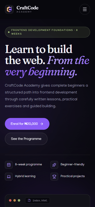
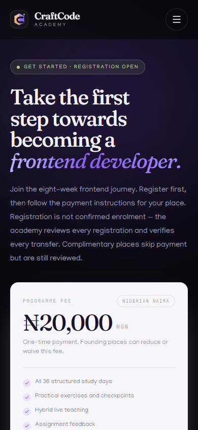
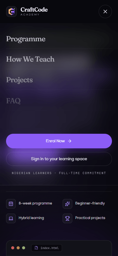
The same argument at 390px.
10 / Reflection
The hardest design decision was to leave the wait visible.
It is easy to make an academy look credible and hard to make it honest. I could have hidden the manual transfer inside a simulated checkout, or shown an instant success state. Both would have produced a smoother demo and a worse product.
The decision I would revisit is the breadth of the platform. Lessons, assessments, reviews and remediation are real needs, but building them before the first cohort has run means some workflows are designed from the operator's imagination rather than from observed teaching.
The strongest part of the product is the copy that states what it is not. An academy's reputation is built as much by the people it turns away as by the people it enrols.
Reviewed, not bought
Registration and enrolment are separate states, enforced in the database.
Visible waiting
Status lookup and confirmation copy make manual verification legible.
Teachable structure
Weeks, lessons, assignments and criteria are data, not pages.
Honest limits
No job guarantee, no payment gateway, no simulated capability.
11 / What is next
Prove the operation with a real cohort.
The public site is live at revisions 1.1–1.5. The full Phase 2 platform is built and tested in the working tree. The next release has to close the gap between the two and run the administrator review-to-publication leg end to end.
After that, the priority is not more surface. It is evidence from teaching: where learners actually get stuck, which lessons need rewriting, and whether the assessment criteria are understood.
- Fix the enrolment badge and cohort-date defects before the next window
- Exercise the learner profile page with a learner session
- Commit and deploy the Phase 2 work after a regression pass
- Resolve the Day 1 practice numbering issue in the source material
- Complete Slack delivery or remove it from release scope
Next in The Casebook
One Practice, Two Records
A product design casebook for a personal portfolio built around two records: a Casebook for product design and a Build Log for frontend engineering, connected by an Overview and a shared visual system.